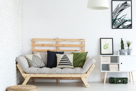
Mixing and Matching Different Prints
Are you tired of your current design scheme? Perhaps, it has been a while since you have changed things up, and you are ready to see a new design in your space. By merely mixing prints and patterns, you can liven things up and create an eye-catching design scheme in your once dull design. If you have tried accomplishing this style before, you may know that getting the end product to look great can be a bit of a challenge. Fear not; we have four tips for mixing and matching different prints. Let’s take a look!
Three or More Patterns.
To effectively mix and match patterns, you should choose at least three or more prints. Three is the minimum number of patterns you should use when mixing prints. Be aware that the more patterns that you use, the more challenging it can be for a novice to pull off the final look. When mixing these three patterns make sure they are all of different scale and sizes. The first of the three prints will be the dominant pattern in the room, so you will want to make sure that you carefully choose this print and that you are in love with it. It should be a larger scale because it will make the strongest statement. The second pattern should be very different from the first pattern and slightly smaller. Lastly, the third pattern can be a variation of the other two, but it should consist of one or two colors found in the other patterns.
Use The 60-30-10 Rule.
We often use the 60-30-10 rule when devising a color scheme strategy; however, the same concept can be applied when mixing prints and patterns within a space. When using this approach, you will want to select three patterns or prints that you are interested in using. Use 60 percent of your favorite pattern, 30 percent of the next pattern and the last pattern you should use 10 percent as an accent.
Have Consistent Color Intensity.
To successfully pull off this look, you should work with the same hues. Avoid mixing base colors with pastels or muted colors with vibrant, bold tones. For instance, a small floral print will work great with a larger floral print if they are made with the same dyes. If one is excessively bright or muted, it can be distracting and unattractive.
Evenly Distribute Patterns.
Lastly, you want to avoid decorating the space with patterns on one side of the room. The mixture of prints and patterns should be evenly distributed throughout the entire room. Other elements of the room including the fireplace and other focal points should be part of the design scheme.
Mixing and matching patterns does not need to be a complicated process. In fact, with the four tips listed above, we believe that you will be able to conquer this design scheme with the utmost knowledge. Happy designing!

